


College branding brings together students, alumni and fans across generations. My dad still proudly wears his old South Dakota State University sweatshirt, showing off the same yellow jackrabbit and bold blue text current SDSU students know and love.
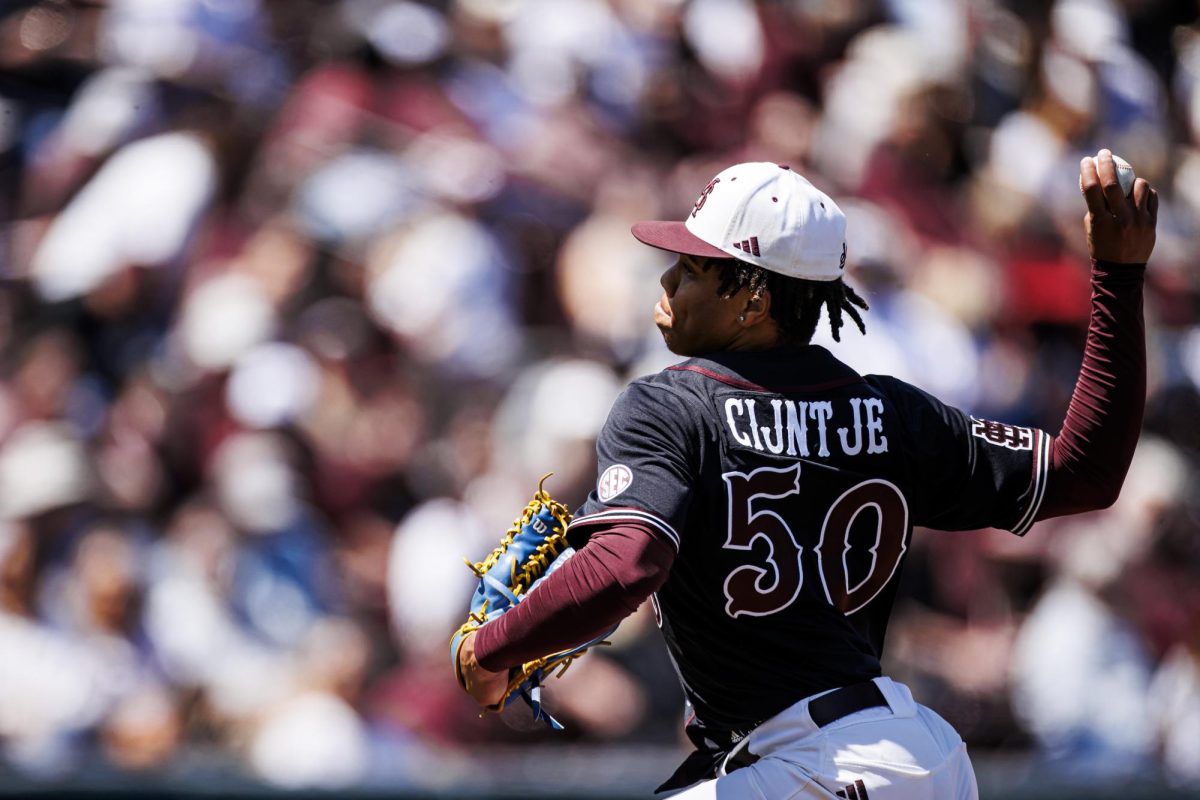
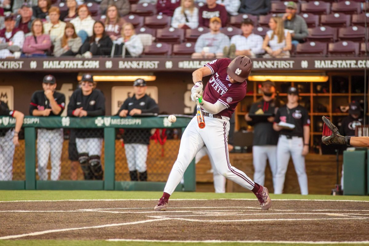
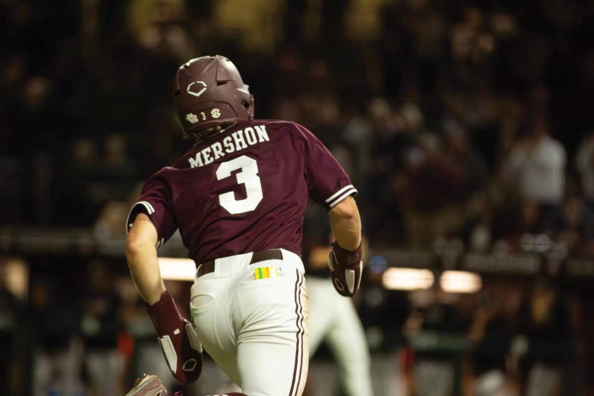
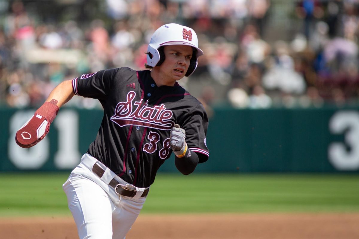
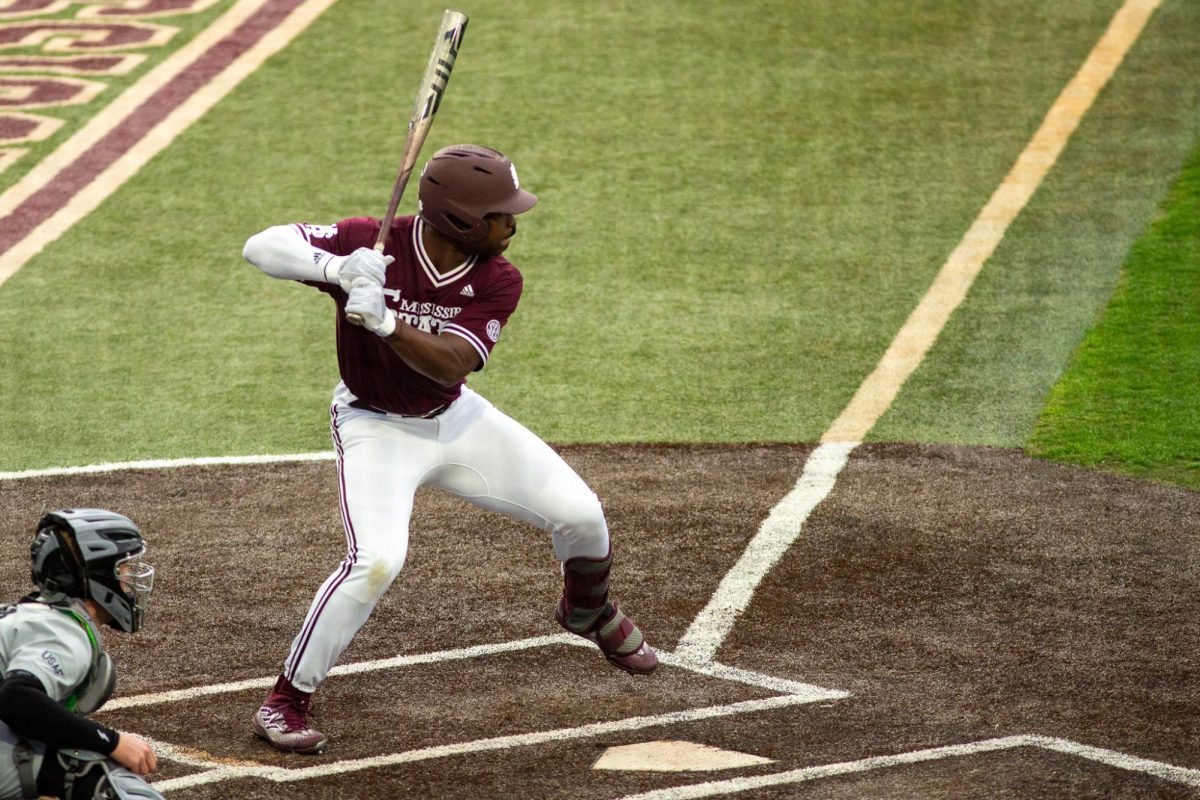
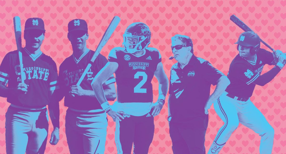
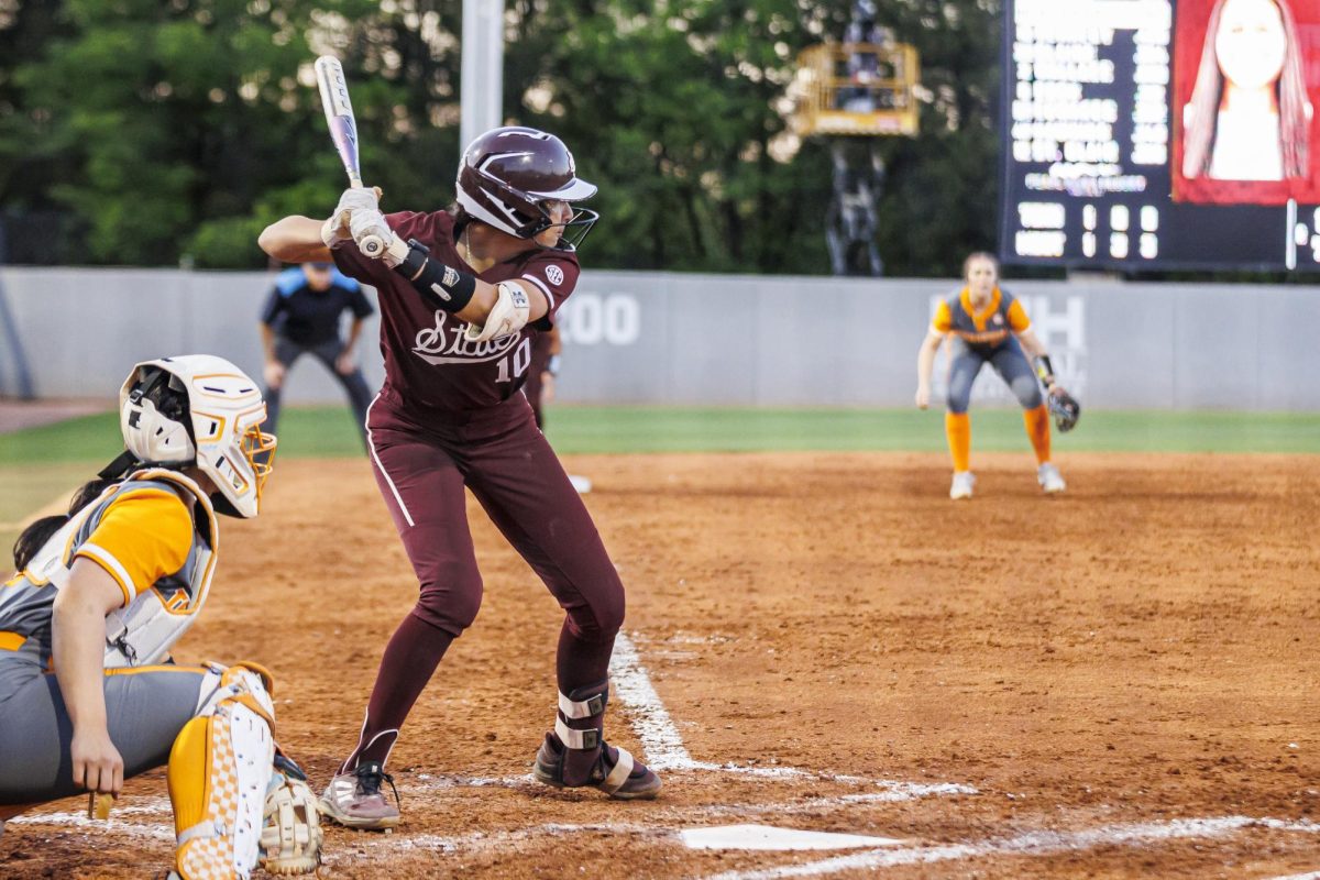
But when colleges undergo rebranding, there will always be people who do not like changes. This is me in the recent use of the “State” baseball script mark across all athletics teams. In fact, I think something entirely new should have been created.
I do not claim to be a graphic designer, but I do know a thing or two about the theories around typefaces and communication. However, I decided to talk to Anna Blount, a public relations professor in the Department of Communication and successful digital designer, to discuss the logo.
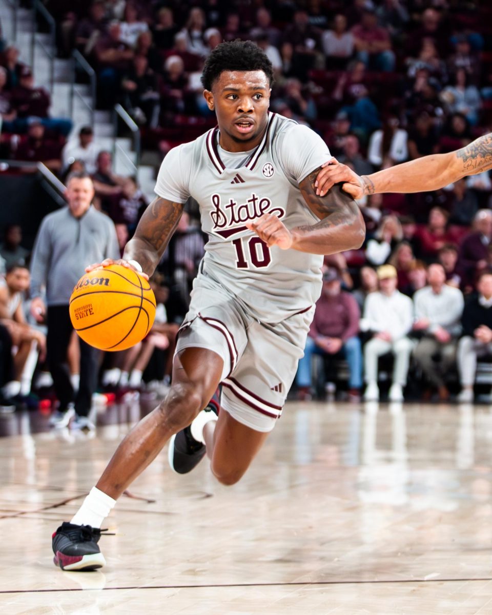
Among other reasons, Mrs. Blount said she likes MSU’s decision to officially use the script “State” for all of athletics because the new mark feels “classic and collegiate.” In Mrs. Blount’s Public Relations Production class, we learned a lot about the different kinds of typefaces. There are generally four main categories: serif (like Times New Roman), sans-serif (like Calibri), decorative (with patterns and decorations in the letters), and script —like MSU’s “State.”
We also learned that each typeface has a certain persona that should be understood to convey consistency in a brand’s tone. For example, Apple notoriously uses sans-serifs because it feels modern and bold. Vogue uses serifs because it is classic and dependable. Script fonts, on the other hand, evoke feelings of creativity and elegance — which are all descriptions that do not fit our football team.
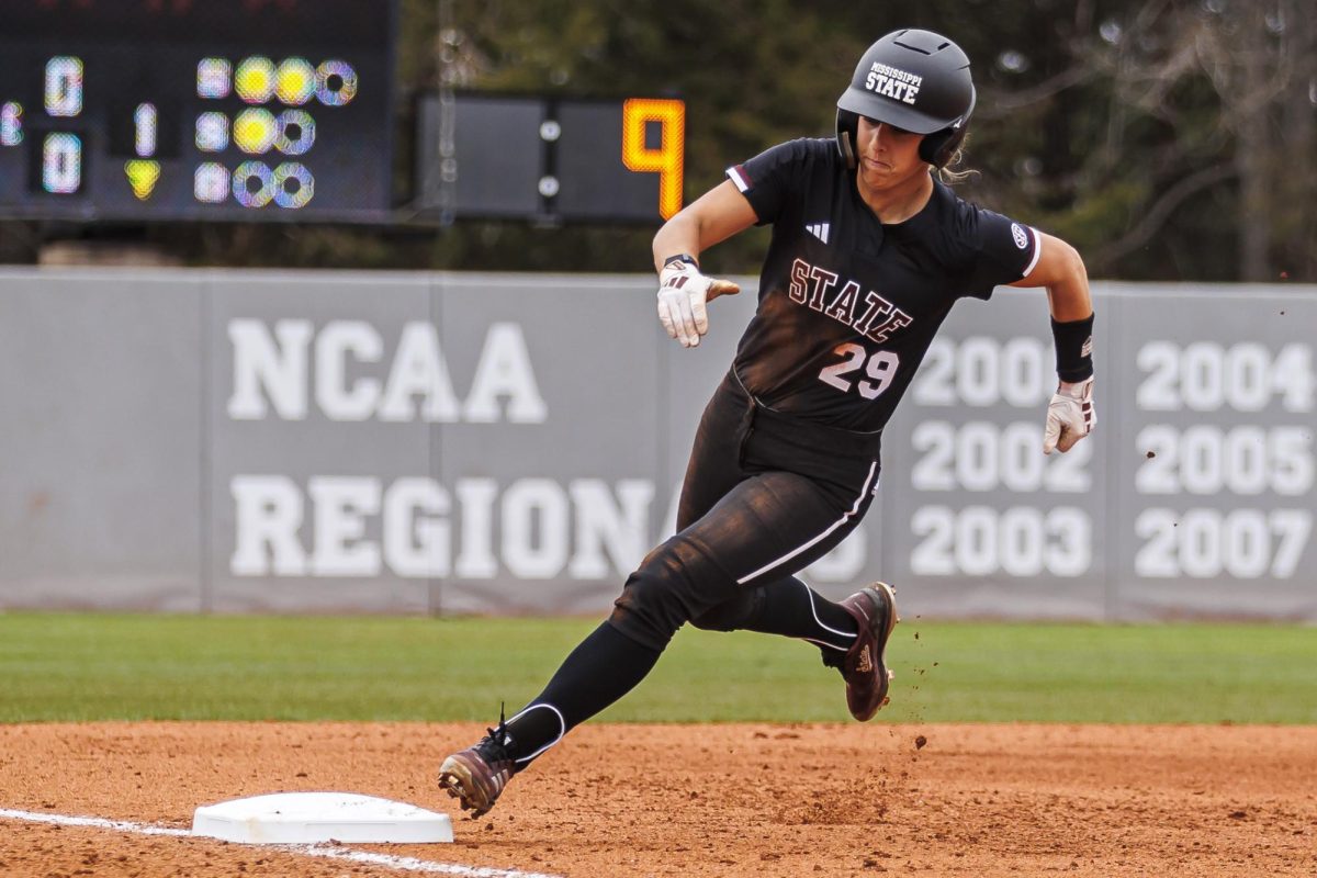
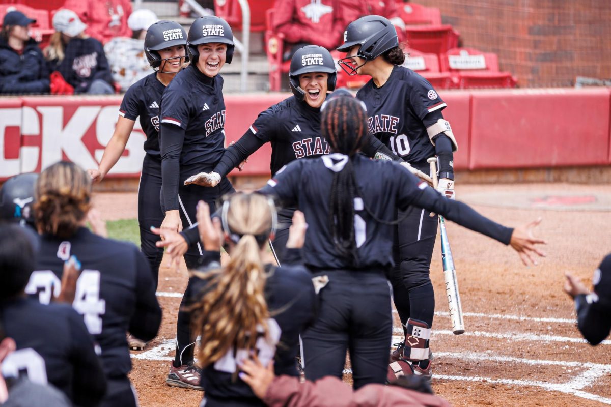
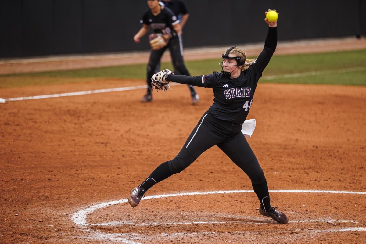
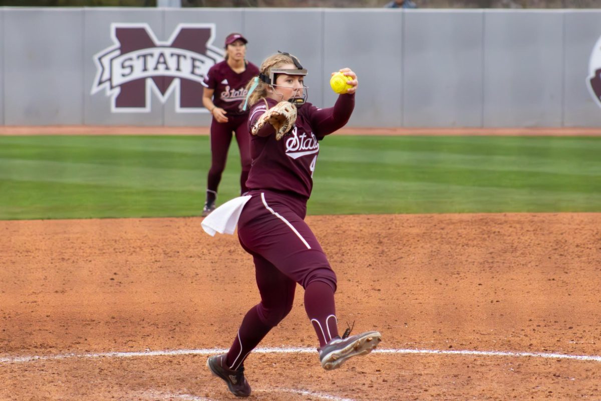
I believe baseball gets a pass on these descriptions because it is regarded as America’s National Pastime. I do not think it is inappropriate to use script typefaces for baseball since it is already viewed as a traditional, laidback sport.
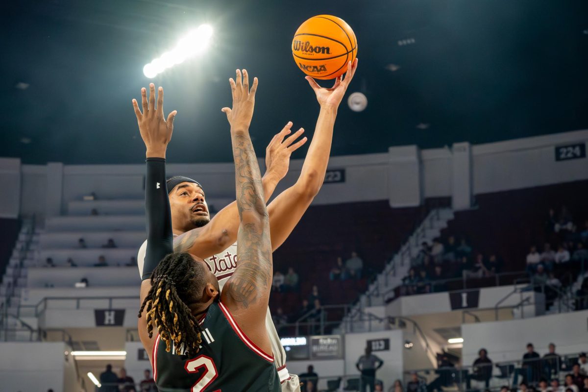
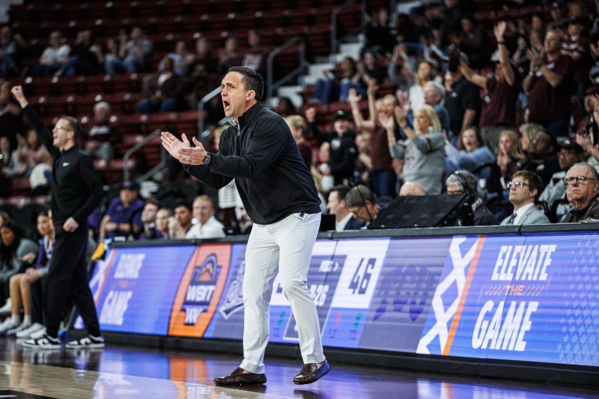
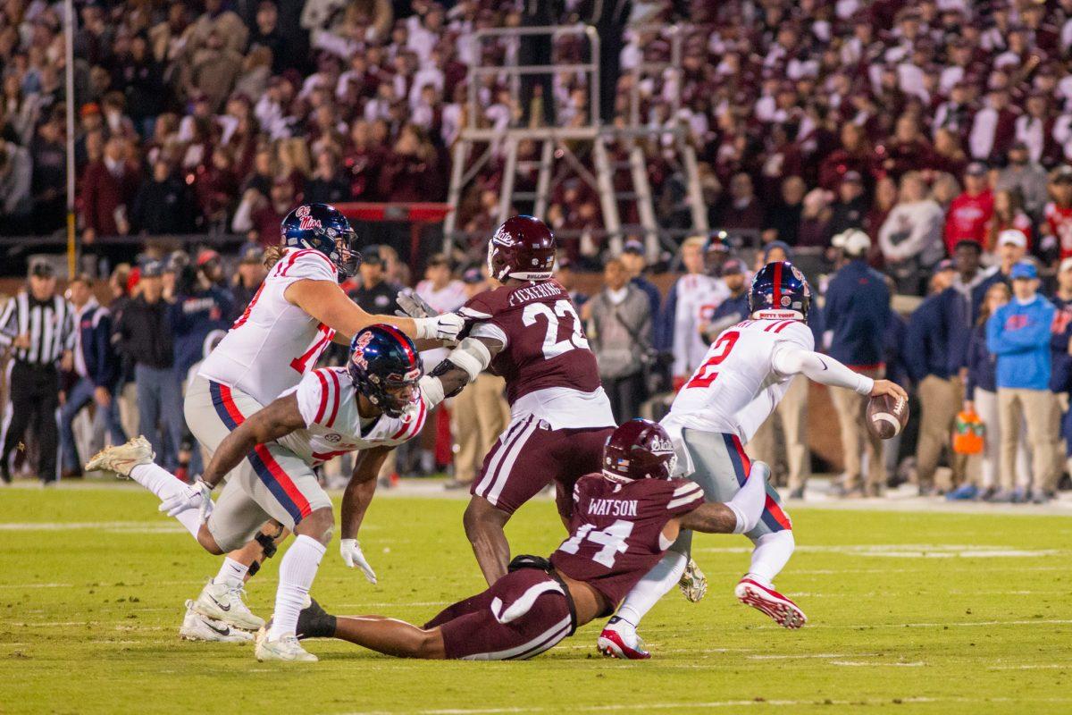
Football, on the other hand, is commanding and intense, warranting something in a sans-serif to match the electric energy football has. Which is exactly what the official MSU football social media already does with bold and stretched type on gameday graphics.
My first reaction when I saw the script State mark on the football field was confusion. I could not figure out why they put the baseball mark on there. In fact, I even wondered if it was placed there with anticipation for a bad football season to give us fans another sport to look forward to while they watched interceptions get thrown. I am not certain this is not the case.
My second reaction was that I actually liked the mark, just not for football and not for MSU overall. Trust me, I will be getting plenty of merchandise with this script mark because it’s objectively fantastic. It is crisp, sleek and timeless.
However, for a university that is known for its agricultural and engineering education and research industry, the script style does not feel representative of our university’s strengths.
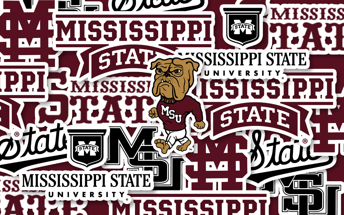
The University of Mississippi uses a script typeface across all their athletics since it is the university logo. They are also known to have a more preppy culture. MSU is down to earth and industrially innovative. With those combined, the quest to unify all of athletics with the script mark, no matter how attractive it is for baseball, makes our branding ironically even more scattered.
I like the script mark for baseball. I like the idea of being like other SEC schools and having fewer logos and marks to unify our programs. However, when looking at MSU’s culture and the meaning behind typefaces, the “State” mark should have rested peacefully on baseball jerseys instead of being forced to represent the entire department just because of popularity.
MSU branding woes: Script font belongs to baseball, not football

opinion 11/1/23
About the Contributor

Elisa Stocking, Staff Writer
Elisa Stocking is a senior communication major. Elisa is currently a staff writer for The Reflector.
More to Discover